When we invest in women, we invest in stronger families and communities.
Brand Identity ,Website
Women’s Fund
case study
#e2a8b6

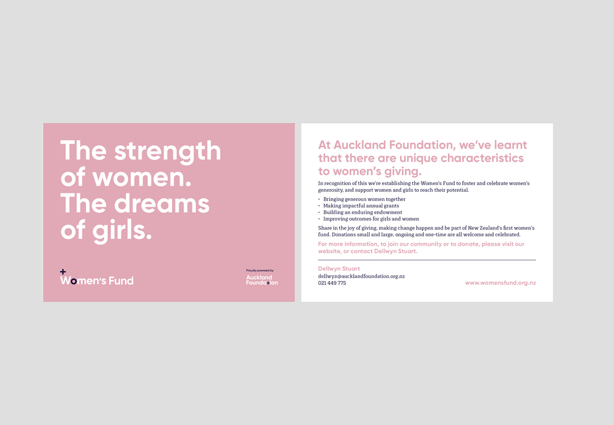
Founded by Auckland Foundation, Women’s Fund was set up to make a lasting impact for women in and around Auckland.


<p style="font-weight: 400">From encouraging leadership and confronting barriers, to helping women excel through financial independence, education, careers and transition points in life, the Women’s Fund provides support to women from all walks of life.</p>
<p style="font-weight: 400">With the potential for growth outside of Auckland Foundation through local community foundations, the development of a sub-brand was deemed necessary. Spruik’s challenge was to develop a creative solution that would not only work in conjunction with the Auckland Foundation brand, but also stand-alone independently.</p>
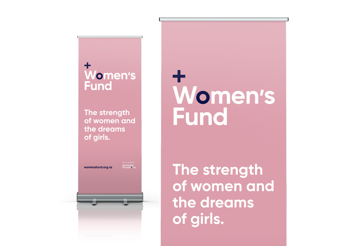
<p style="font-weight: 400">The plus sign is an integral part of the Auckland Foundation brand. Its symbolism for addition, positivity, growth and generosity are all sentiments that also relate to the Women’s Fund. The plus sign coupled with the O within ‘Women’s creates a connection to the Auckland Foundation brand, while also representing the Venus symbol, which denotes nurturing, infinity and continual giving.</p>
<p style="font-weight: 400"><a href="https://www.aucklandfoundation.org.nz/womens-fund"><strong></strong><strong>aucklandfoundation.org.nz/womens-fund</strong></a></p>
Placeholder text


