A shared journey of ups and downs. Highlighting inequities experienced by Aotearoa’s young women of colour.
Identity ,Naming
Share The Elevator
case study
#f37435
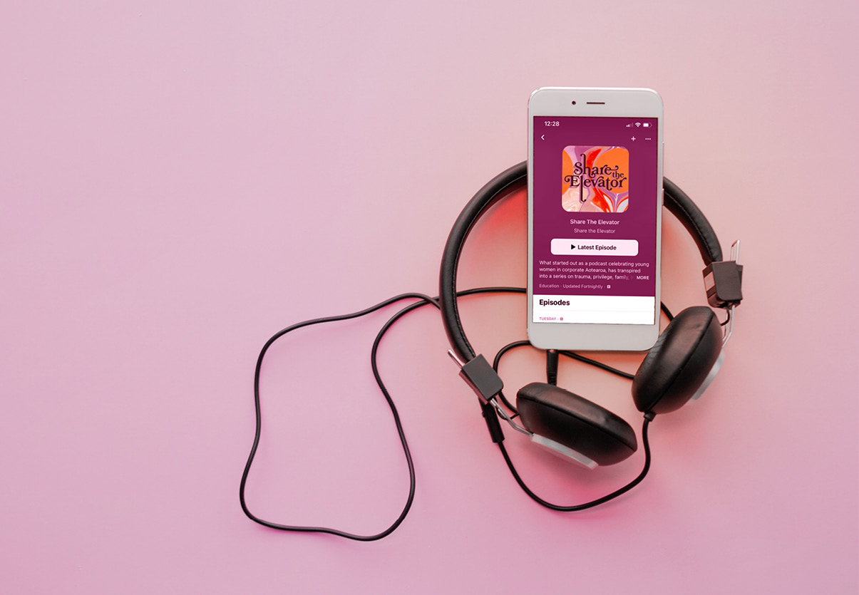
Share The Elevator is a podcast that shares a perspective on the reality of diversity and inclusion. In the 13 episode podcast series, challenges and triumphs of six young women of colour, starting their careers, are explored.
<p style="font-weight: 400">We were thrilled to be approached by YWCA to provide strategic thinking, naming and branding for this powerful initiative. Firstly we needed to work closely with the team to understand the audience. Ensuring that we could then create a name and identity that were memorable, and held a deeper meaning. With this in mind, and several workshops later, we created, Share The Elevator.</p>
<p style="font-weight: 400"><strong>The Meaning</strong></p>
<p style="font-weight: 400">Share the Elevator represents a space that takes you on a journey – be it up or down. It’s a space where you can have a private conversation and the size usually makes it feel a little bit personal. And yes, can at times, be rather awkward. It’s a metaphor that represents sharing thoughts, space and opinions with another.</p>
<p style="font-weight: 400"><strong>The Craft</strong></p>
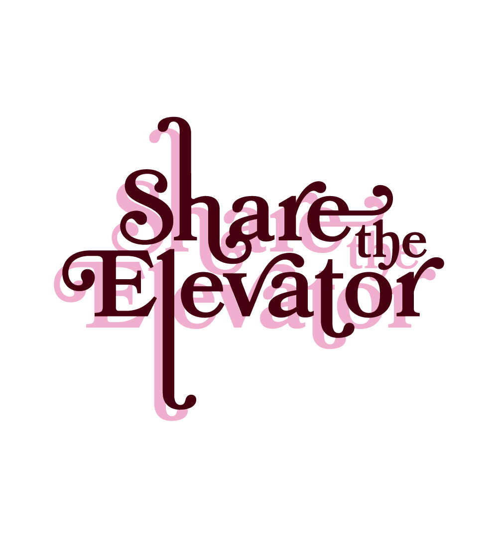
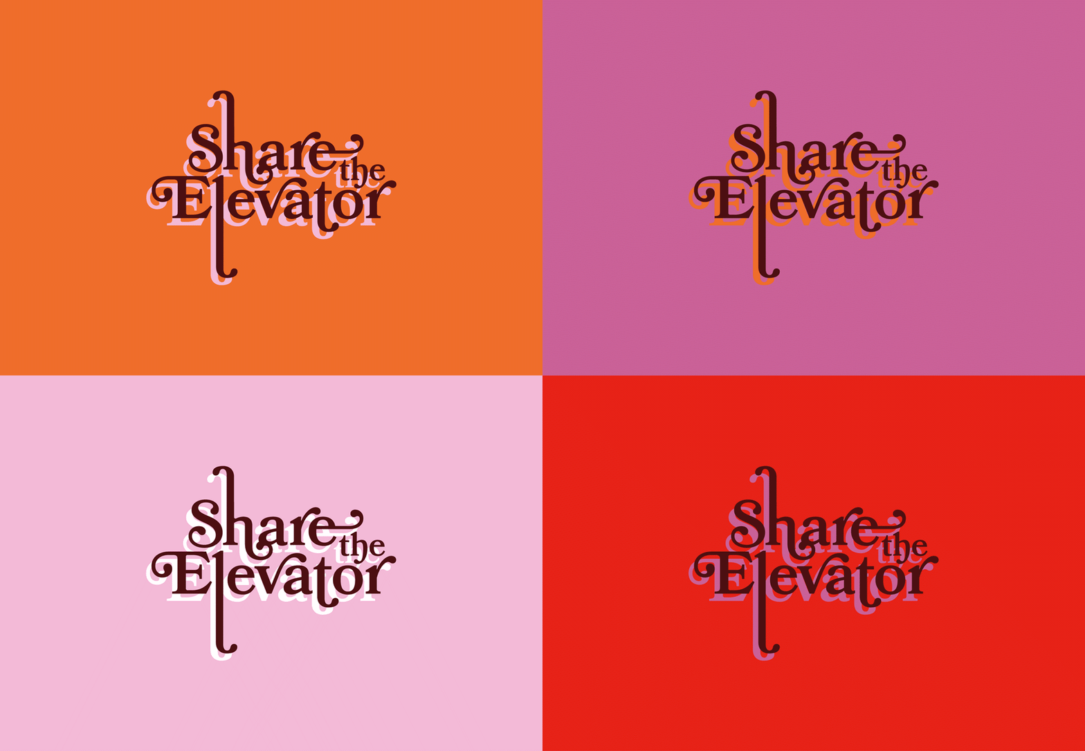
<p style="font-weight: 400">To accompany the name we then created a confident, curvaceous logo as a modern take on a 70’s design. Rounded edges of the typography are both inviting and feminine, leading your eye around the logo. Elongating the ‘h’ and ‘l’ help to create a sense of movement up and down, mimicking the movement of an elevator. This flow echoes the ups and downs that young women face when transitioning into adulthood and starting their careers.</p>
<p style="font-weight: 400">Additionally, the bold drop shadow links to the podcast’s double episode concept.</p>
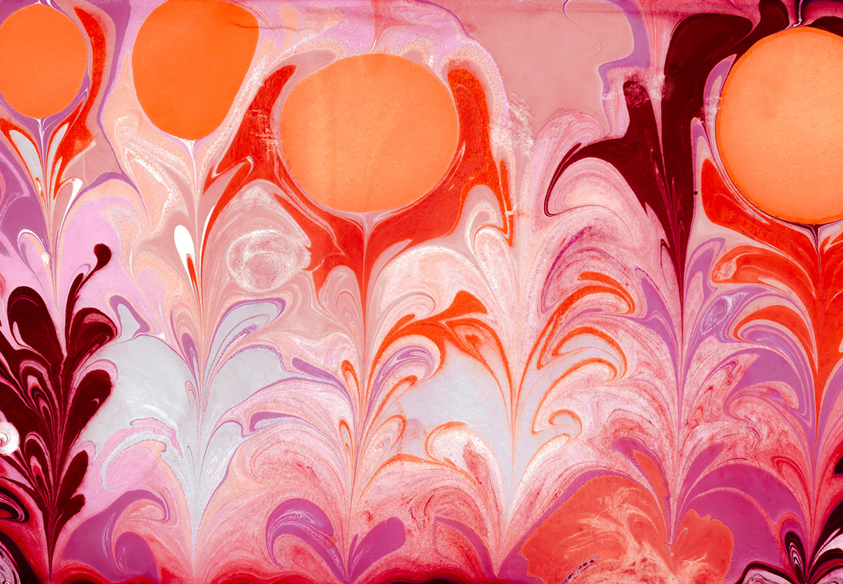
<p style="font-weight: 400">Finally we paired the logo with marble art. Marbling is the technique of floating ink on water to create patterns and transferring onto paper. Inks do not mix. We created marble backgrounds as a juxtaposition to the concept of Share the Elevator. Vibrant coloured shapes morph and change their form but remain closed off from other coloured inks. Large circles interrupt the pattern and form a growing space of inclusion – the elevators.</p>
<p style="font-weight: 400"><strong>“Spruik took a challenging brief from us – to create a name and branding for something we were yet to create – and delivered a sterling result. Their consideration of the audience, hosts and intention of the project all fed into the strategic thinking and powerful name. Then came some visually stunning designs from Spruik that brought the name to life. The whole process was enjoyable and rewarding with a great outcome.” </strong></p>
<p style="font-weight: 400">Angela Barnett, YWCA</p>
<p style="font-weight: 400">You can listen to the podcast <a href="https://open.spotify.com/show/4f0aKG21sF9KRdyMuqx6YR?si=4f56129647374e26">here</a>.</p>
Placeholder text
