Identifying what differentiates Invisible Zinc, and leaning into the brands unspoken authority.
Brand Repositioning ,Creative
Invisible Zinc NZ
case study
#FFB60F

Competition in the New Zealand skincare market is fierce – Invisible Zinc currently sits within the top 5 in the sun protection category.


<p>Invisible Zinc is more than just an ordinary sunscreen to use at the beach. Unlike chemical sunscreens that absorb the suns UV rays, Invisible Zinc uses naturally sourced Zinc Oxide to create a physical barrier on the skin, reflecting both UVA & UVB rays. The trouble is, consumer’s do not fully understand what Zinc does – the mode of action, the benefits, efficacy or superiority. We needed to define mineral sunscreens as the superior choice in the minds of the consumer with a simple brand statement that sets Invisible Zinc apart from the competition.</p>
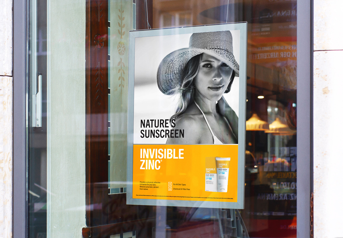
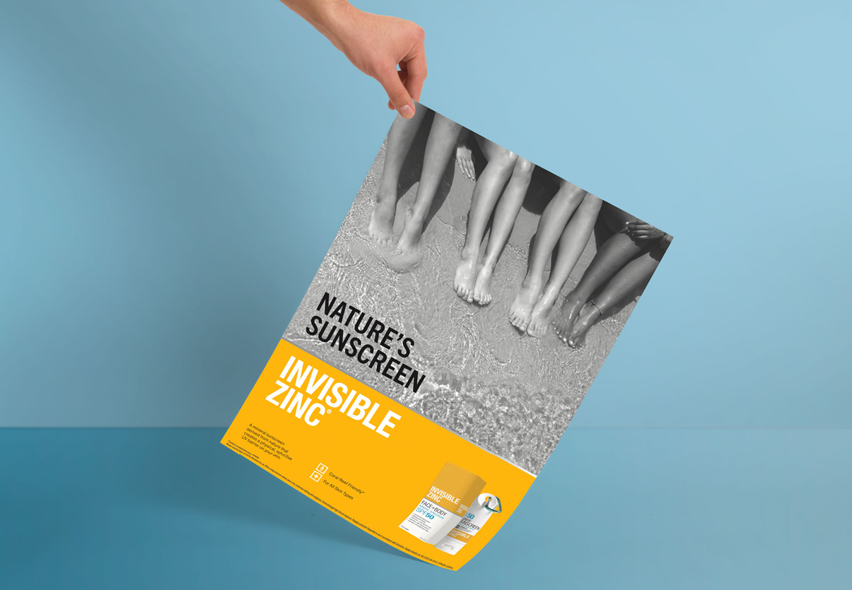
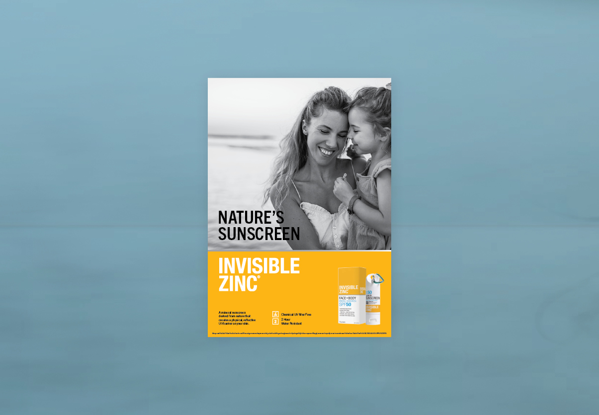
<p><strong>‘Nature’s Sunscreen’</strong></p>
<p>With this statement, we establish Invisible Zinc as THE mineral sunscreen chosen by nature. Confident and weighted, it also educates the consumer and appeals to those House-hold shoppers who care about natural ingredients and prioritise their family’s health.</p>
<p>We then aligned the campaign design aesthetic with the hugely identifiable product packaging. Pairing the new messaging with emotive black and white photography that is inclusive and representative and of the New Zealand market. The result speaks to quality and brand congruency.</p>
Placeholder text


<p>Here is some extra text</p>