Aligning with the Kiwi market
Brand Repositioning ,Campaign Creative
DermaVeen Sensitive Sun
case study
#f28502
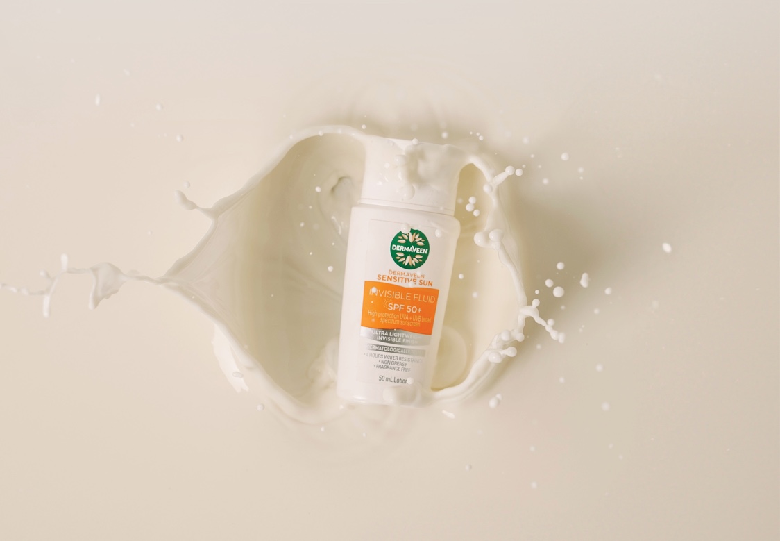
A brief of 2 parts – Spruik was tasked to position the new sunscreen range, DermaVeen Sensitive Sun, and launch their new facial sunscreen product, Invisible Fluid, into a market with a strong market leader.
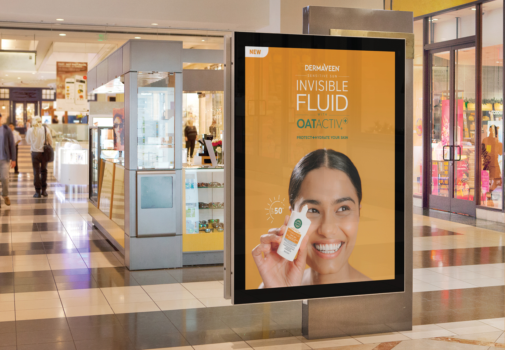
<p>The competition in the ‘Skinification’ of sun category is fierce, with products offering consumers similar benefits. We needed to distinguish a clear point of difference for the DermaVeen Sensitive Sun range here in New Zealand.</p>
<p>Visually there was a lot to consider. The DermaVeen brand has an established identity with many ranges under the umbrella, including claims and developed ingredient logos. Furthermore, the sensitive Sun product packaging design and creative assets had already been established by the Australian team. Our challenge lay in pulling all of these elements together harmoniously to establish a unique narrative for the range, while seamlessly linking it to the DermaVeen family of products.</p>
<p>Consumers are growing ever knowledgeable and concerned with ingredients with in their beauty products and are seeking transparency. Through our research, we discovered that the DermaVeen range is the only sunscreen range containing colloidal oatmeal in all its product sku’s. This became the white space that lead to our approach.</p>
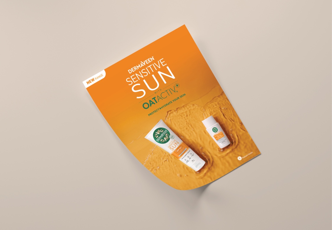
<p><strong>We developed 2 logo lockups to incorporate the key ingredient that would unite material that speaks to the range, individual products, and even other product ranges under the DermaVeen umbrella.</strong></p>
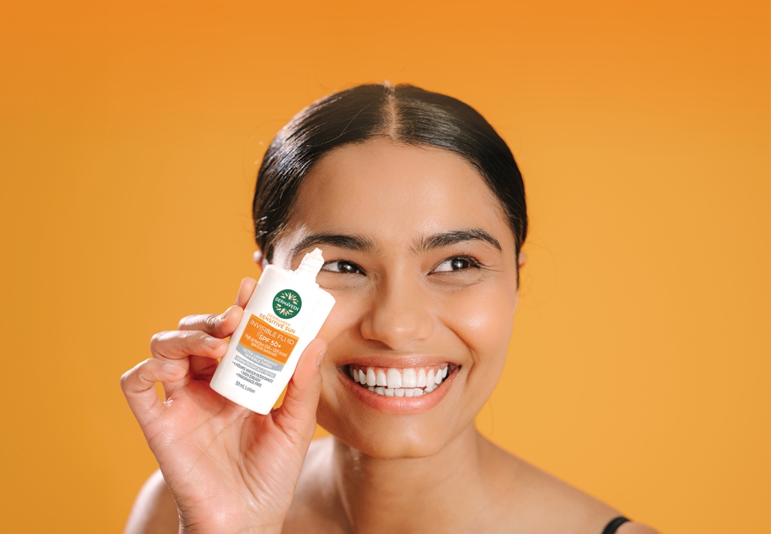
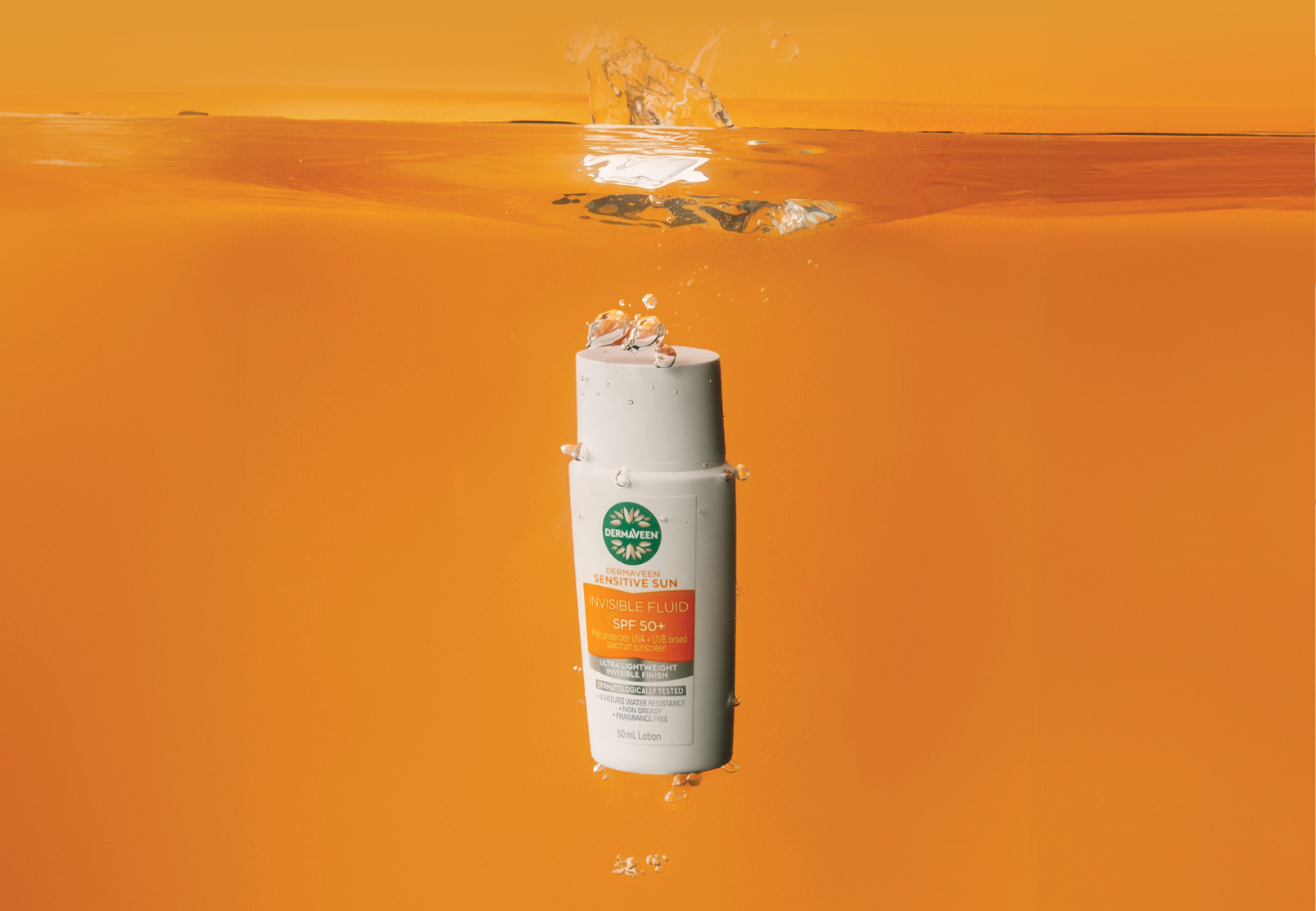
<p>Combining the colours of oat milk with the vibrancy of sunny orange is a strong visual link to the product benefit and usage. Protection for sensitive skin in the sun.</p>
Placeholder text

QHJhpQ95ok8