Establishing a visual identity and striking brand touchpoints to elevate a law firm.
Identity ,Positioning
Davenports Law
case study
#3b4c53

Davenports Harbour Lawyers was a long-established and dynamic legal practice based in Auckland.

<p style="font-weight: 400">While the practice had grown significantly the directors felt that there was a disconnect with their former brand positioning and were not maximising opportunities in an evolving marketplace. We were tasked with researching their current brand and creating a strategic plan to better connect with their audience.</p>
<p style="font-weight: 400">Our first step was to perform an extensive brand audit where we ran a series of workshops with key stakeholders to discover more about their business and their unique offering and ethos. These workshops were essential to establish the foundations of a new direction that resonated fully with their prospective client personas. From our research, it was clear that a name change from ‘Davenports Harbour Lawyers’ to a more succinct ‘Davenports Law’, would be the first move towards a more refined and simplified identity.</p>
<p style="font-weight: 400">With the Davenports Law audience clearly defined, it became clear that their visual identity required a major overhaul.</p>
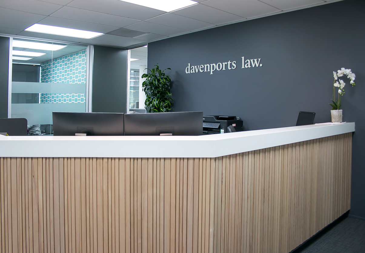
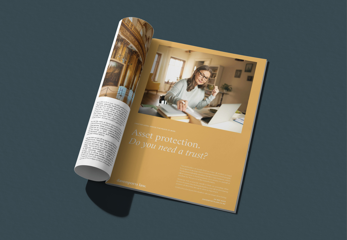
<p style="font-weight: 400">Their identity is now conveyed through a minimalist treatment across all design elements, while the use of a traditional serif typeface conveys experience and wisdom – which speaks to their clients desired outcome – peace of mind.</p>
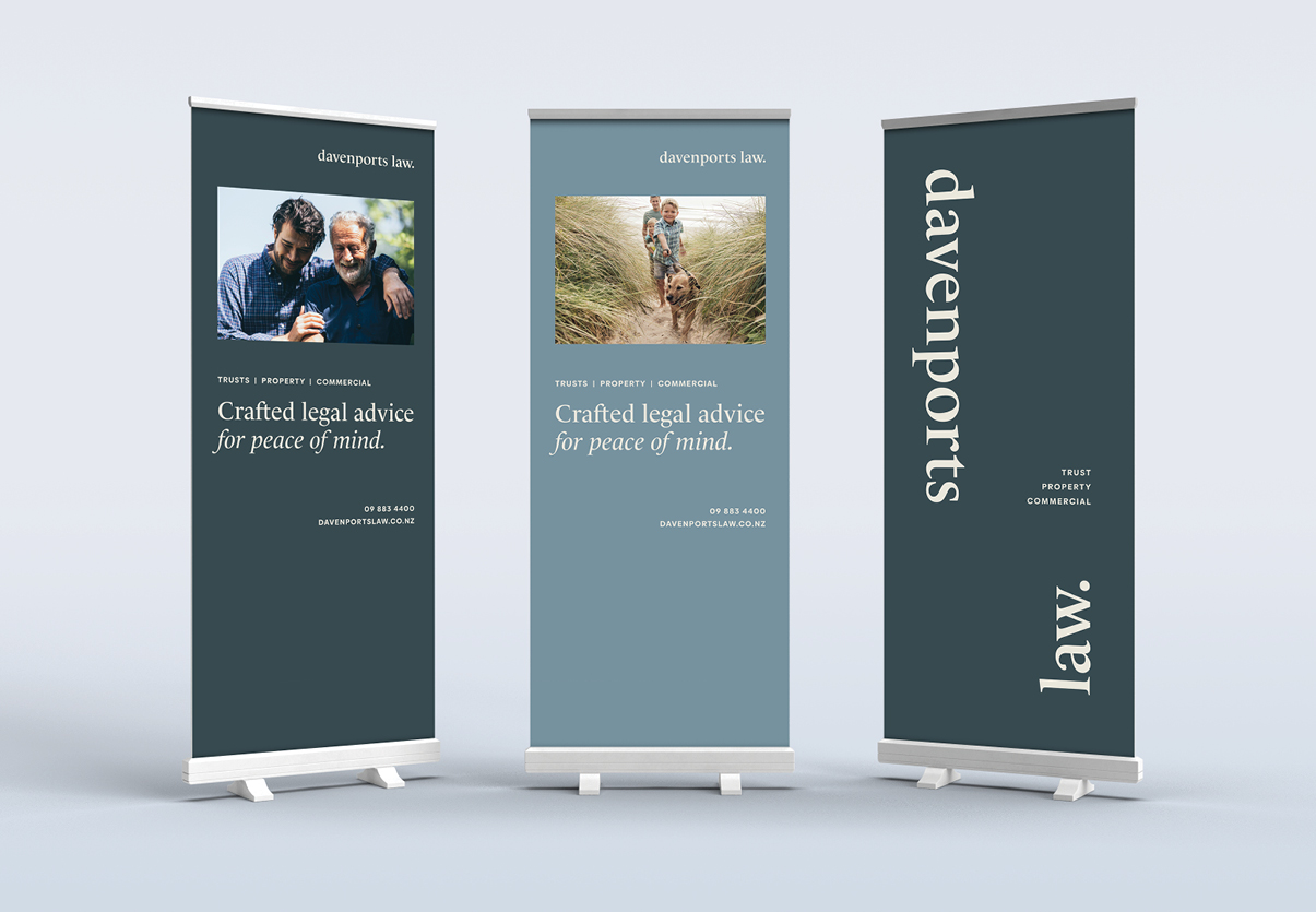
<p style="font-weight: 400">A contemporary design twist was achieved by <em>splitting</em> the logo in chosen applications and developing a monogram for flexible usage. This adds a definitive aesthetic point of difference to their identity and is representative of Davenports dynamic and progressive attitude.</p>
<p style="font-weight: 400">A supporting palette of complementary tones and imagery were also developed to be reflective of the core brand ethos.</p>
<p style="font-weight: 400">As well as the visual aspects of the brand we guided Davenports through a comprehensive brand evolution process to position the company as the truly unique organisation that it is — one that every team member is proud to be part of.</p>
<p style="font-weight: 400"><strong>Davenports Law.<br />
</strong><strong>Crafted Legal Advice For Peace Of Mind.</strong></p>
<p style="font-weight: 400">The new name is memorable, the tone of voice and identity is warm, welcoming and customer-centric. Every aspect of the brand evokes the harmonious feeling that grows out of the Davenports team’s shared passion for crafted legal advice, combined with an easy-going, friendly approach.</p>
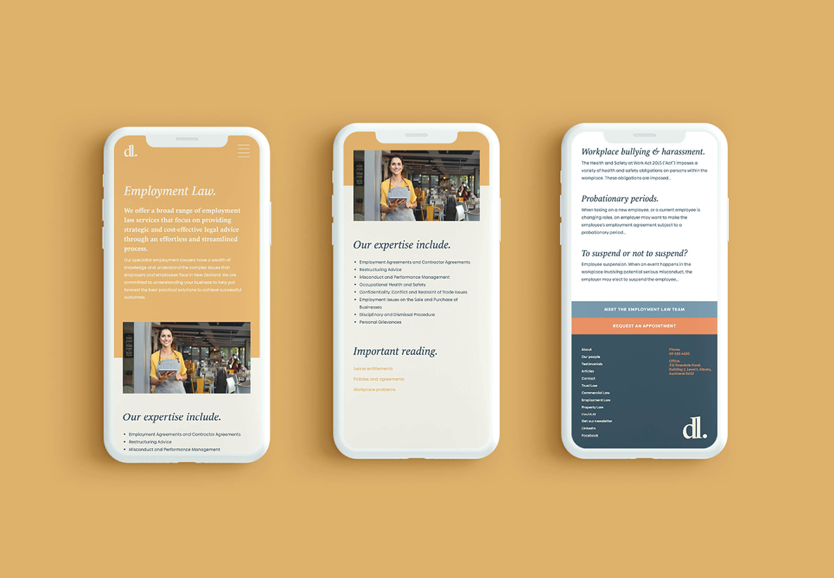
<p style="font-weight: 400">As part of the roll-out we built out their digital touchpoints including building a website that focussed on creating an engaging online experience for their audience</p>
<p style="font-weight: 400"><strong>davenportslaw.co.nz</strong></p>
Placeholder text
